Exploring a report in Numerable
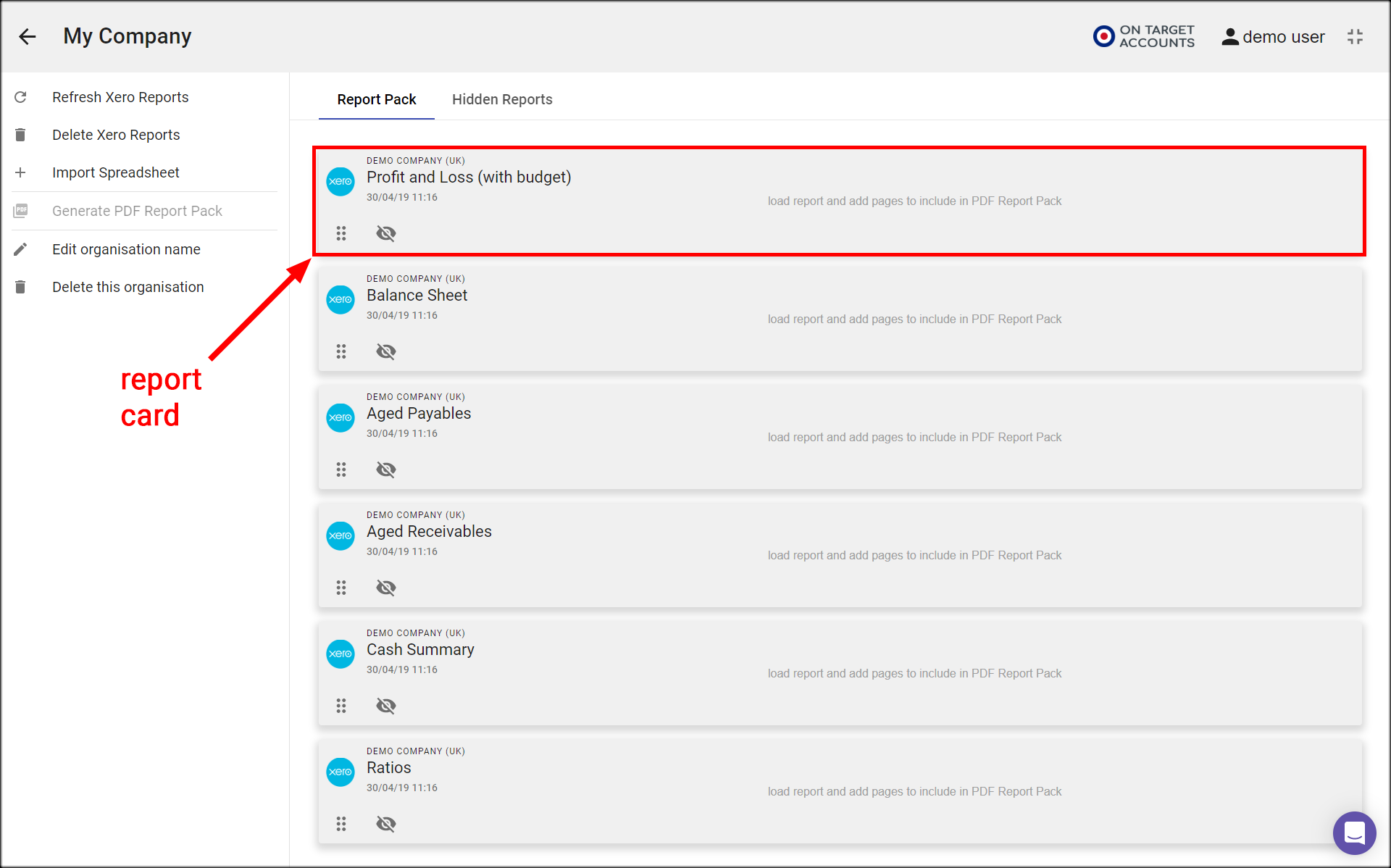
Load a report in Numerable
- On the Organisation page, click on the report card for the organisation and report you want to explore.
- This takes you to the table view of that report, and you can now start to explore
Change between 3 views
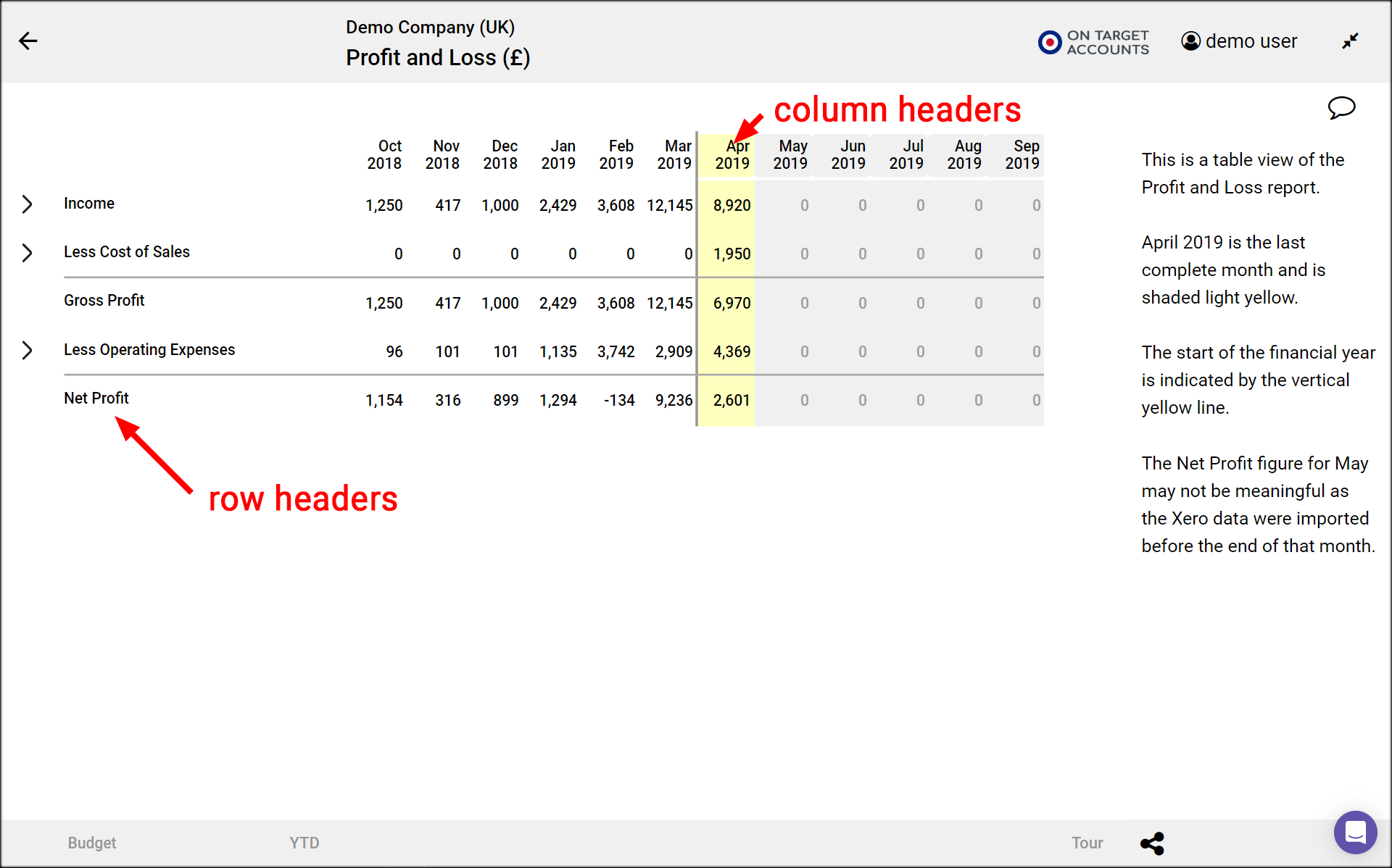
- When you first load a report you see it in table view, as columns of numbers.
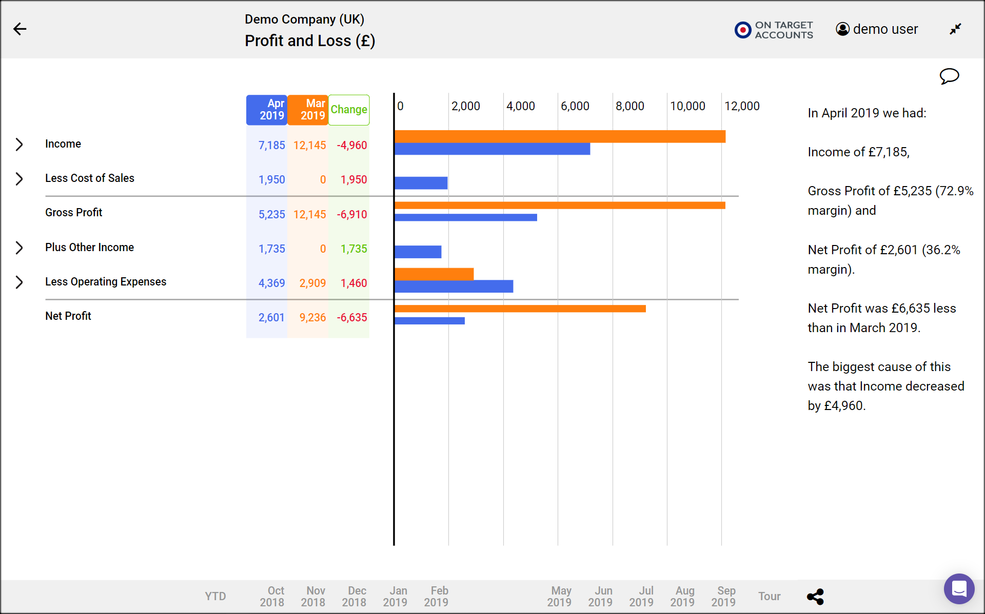
- Click on a month header to change to structure view, and see a horizontal bar chart of the figures in the selected period.
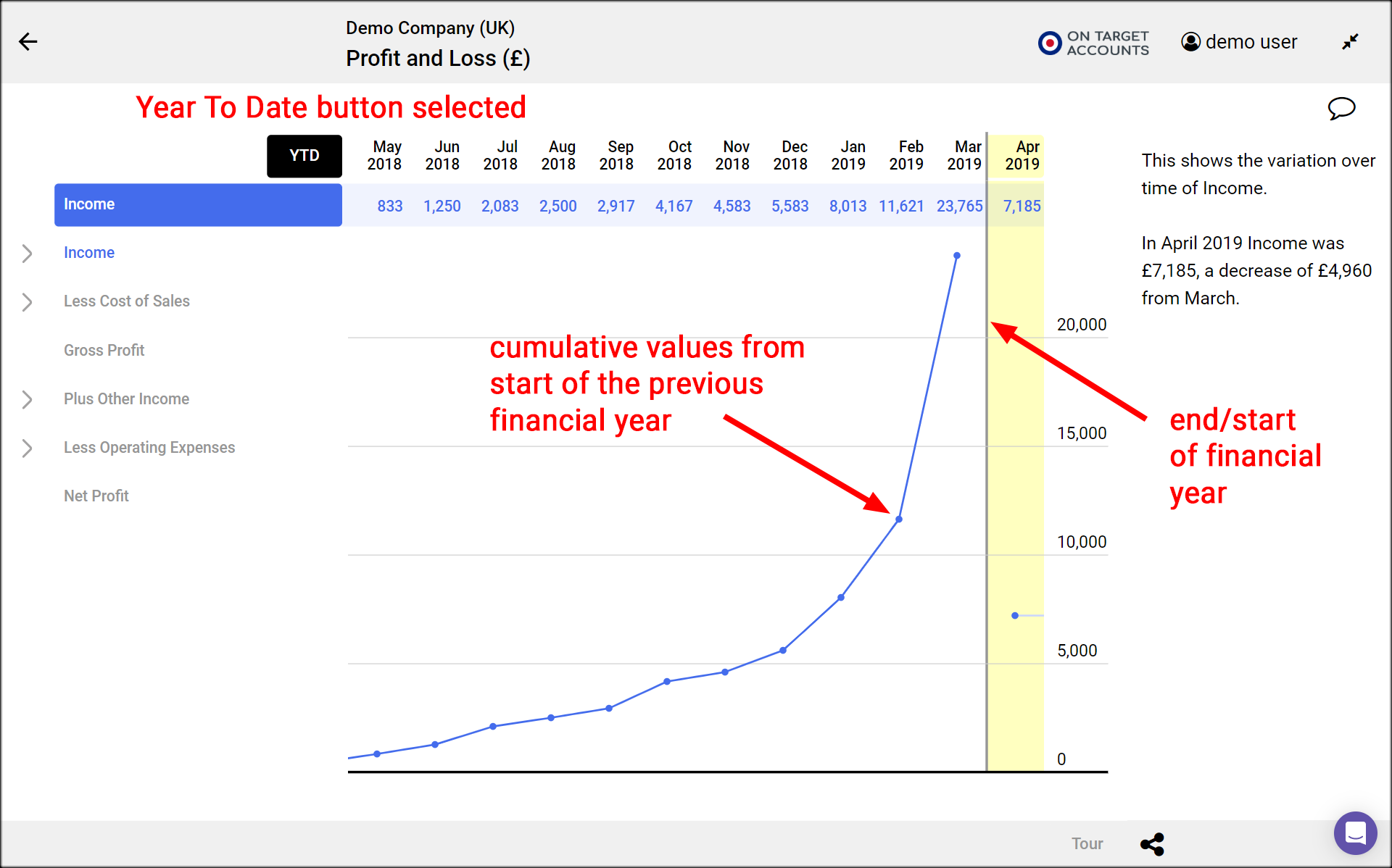
- Click on one or more row headers to change to a time series graph of those rowss values plotted against time.
- Deselect all headers to go back to table view.
Compare time periods and budgets
- Click on 2 month headers to compare results for those months.
- The values of the first selected month are in blue, and those of the second selected month are in orange.
- Clicking on the Change button shows the changes from the second selected month to the first as green and red bars, indicating good and bad changes.
- Click on the Budget button to compare the first selected month’s results to their budget. The Budget button is only shown if budget data has been entered in Xero’s budget manager.
Drill up and down
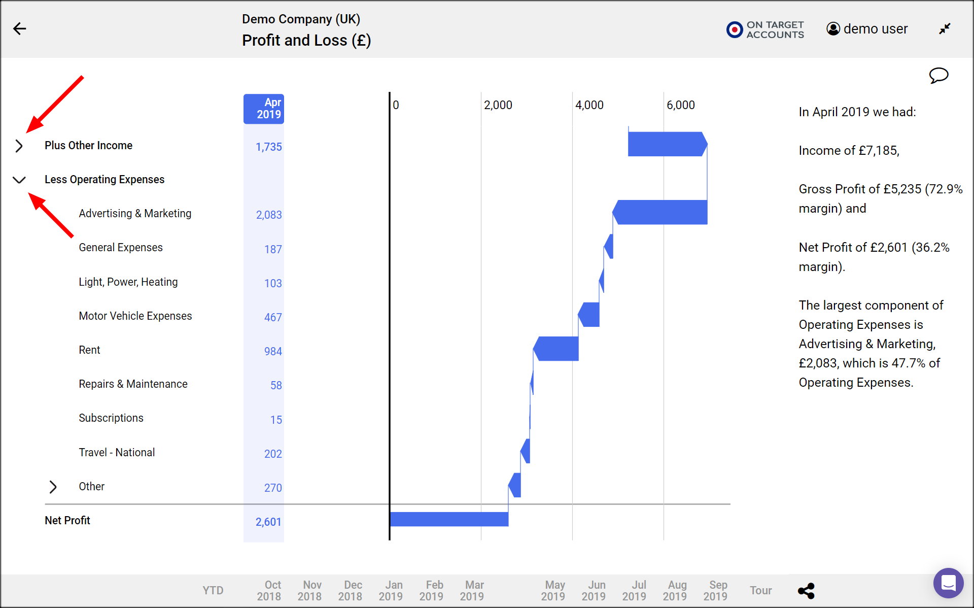
- Click on a right chevron to expand a total and show its components.
- You see the expanded rows in all 3 views.
- Click on the down chevron to collapse the row again.
View text insights
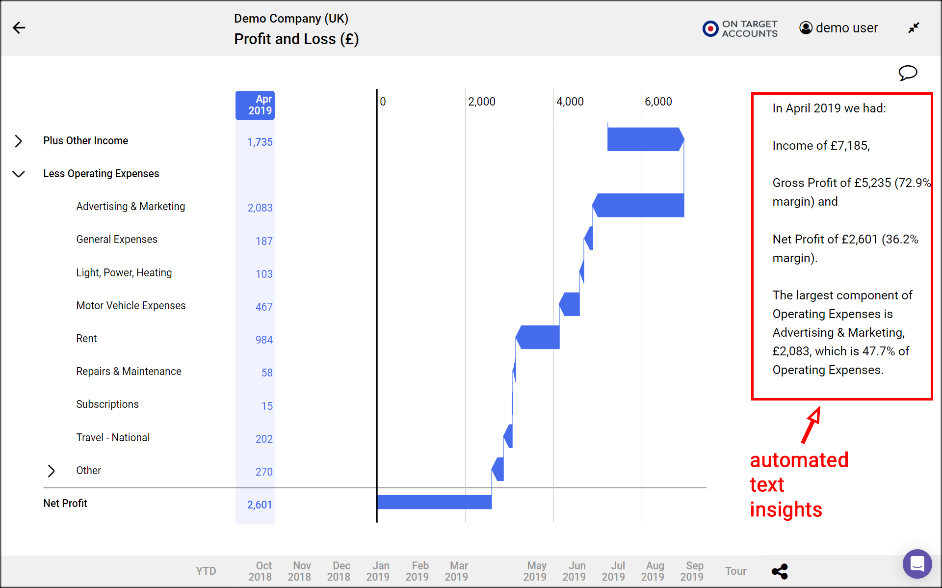
- Numerable automatically generates text that explains what is shown in the plot.
- The text appears in the right column
- It changes to give insights into the current view and selections.
YTD – Year To Date
Numerable normally shows you the figures for a month in each column. But sometimes it is useful to see the year-to-date (or YTD) results, to assess performance since the start of the financial year.
- To see those year-to-date click on the YTD button which is to the right of the column headers.
- The figures or plot you see now are cumulative, starting from zero at the start of the financial year
- The financial year start is shown as a vertical grey line in the table view and time series plots.
- Year-to-date is currently only available in the Profit and Loss statement

